
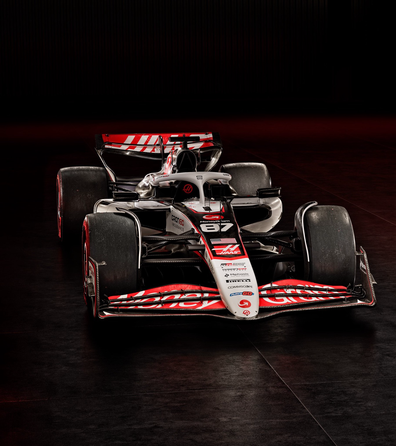
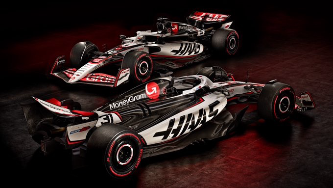
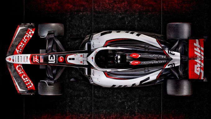
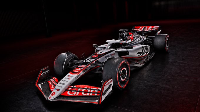
Haas liveries always seem to uninspired. Or is this simply the American© style?
They’re all uninspired; it’s all a team color with a bunch of corporate logos. The best element on the grid is a Duracell battery
Yeah but Haas manages to take white and black - not actual colours - and then use them in the blandest shapes imaginable
I’ll take this over the Kick 1990 Clip Art color fade. Looks like a paintball gun from the early 2000s. The only element on the car is the two tone wheel covers being green up front and black in the rear. 0 shapes, 0 design. Just 45 degree line to delineate fade behind the driver.
The rich energy livery was pretty good.
Well, perhaps they’ll be sporting a swastika for the US races, to show support for the glorious leader.
