According to the filing, Lipnik has been fired from Apple “for failing to follow Apple’s policies designed to protect its confidential information, including development devices and unreleased software and features.” The filing also accuses Lipnik of failing to report “multiple prior breaches” to Apple.
When you sign an NDA (non-disclosure agreement), you’d best protect the secrets. Then again, the guy who left an iPhone 4 in a bar didn’t lose his job. Wonder what the differences are between them.
Intent. One was an accident, the other is potentially criminal if I’m not wrong. I could be.
Removed by mod
seems incongruous to me that the NDA is that strict but the prototypes are allowed out in the wild. I guess they need real world testing somehow.
Removed by mod
Plot twist: the liquid glass design was just a decoy they hoped would get leaked before their transparent aluminum design drops,
Looks like shit IMO
Yep, when every app has a gray color, it’s much harder to find what you’re looking for on the screen.
Google committed the same sin when they made every one of their apps have the same four color look - now I can’t easily find the one app I’m looking for.
Which red, blue, yellow, and green icon on a white background are you looking for?

Kinda reminds me of Windows Aero, but with Grey as your main colour.
That example photo is with the icons set to white (or similar). By default the icons are still colorful. They showed it off during WWDC and it looks mostly good.
I’m on the fence, it’s nicer than material design (I’ve always hated ‘material design’ though) but it’s so colourless.
Bring back skeuomorphism!
At least material design is readable.
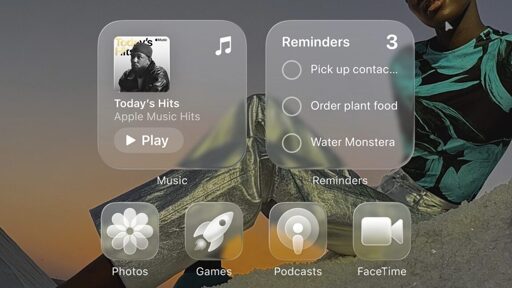
Just to clarify something, because I think the majority of people here only know what iOS 26 looks like from the thumbnail. Below is an actual screenshot of the iOS 26 beta running on my phone.
Just like Android, things are customisable and the icons in the thumbnail are the most egregious version of the new visuals. I find it hard to believe anyone will actually use that styling tbh.

Even the non glass icons look terrible, they include some automatic blur being applied.
Did Apple forget their company operates on hype?