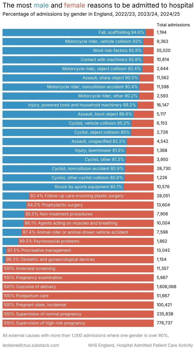
I disagree. It does show the contrast of what most women deal with when compared directly to the male category. And while pregnancy is specific to female (at birth), it is culturally significant because it is so prevalent.
Yes of course, that’s why I said it was important. But this table is about gender disparities in specific reasons for admittance. If the ratio can’t possibly be anything but 100%, what does that tell me about anything other than the self-evidently obvious?
You might as well tell me water is wet or the sky blue. Very true and both those facts are important, but neither is exactly new or surprising information.
I suppose it tells you that there is no male equivalent. I do think it’s interesting that there are so many fewer types of admission skewed toward women that fit the criteria of being skewed by 80% or more, especially when you consider the prominence of pregnancy related types.
I do also think it would be more interesting to see something like the top 15 admission types for men and top 15 for women without the 80% threshold requirement to get a wider spread of women-skewed admissions.
It doesn’t compare directly to the male category because there is no male category listed.
Quite a bit of interesting information on display to be sure, but with 20% of the chart displaying information that excludes one of the two things being compared, it’s not a good representation of what the title suggests.
On a chart showing male female disparity for types of cancer, ovarian and testicular would be just as irrelevant as the bottom fifth of this admissions chart.
In that last sentence of my comment, I was referring to a hypothetical cancer chart, as a comparison to the chart of this post and the inherent uselessness of including information that cannot be experienced by everyone.

I disagree. It does show the contrast of what most women deal with when compared directly to the male category. And while pregnancy is specific to female (at birth), it is culturally significant because it is so prevalent.
Yes of course, that’s why I said it was important. But this table is about gender disparities in specific reasons for admittance. If the ratio can’t possibly be anything but 100%, what does that tell me about anything other than the self-evidently obvious?
You might as well tell me water is wet or the sky blue. Very true and both those facts are important, but neither is exactly new or surprising information.
I suppose it tells you that there is no male equivalent. I do think it’s interesting that there are so many fewer types of admission skewed toward women that fit the criteria of being skewed by 80% or more, especially when you consider the prominence of pregnancy related types.
I do also think it would be more interesting to see something like the top 15 admission types for men and top 15 for women without the 80% threshold requirement to get a wider spread of women-skewed admissions.
I guess it depends on what the chart is made to convey
The chart does include total admissions for each. Category, so you can compare the numbers across categories, I guess.
It doesn’t compare directly to the male category because there is no male category listed.
Quite a bit of interesting information on display to be sure, but with 20% of the chart displaying information that excludes one of the two things being compared, it’s not a good representation of what the title suggests.
On a chart showing male female disparity for types of cancer, ovarian and testicular would be just as irrelevant as the bottom fifth of this admissions chart.
I am a bit confused. Do you mean they purposely grouped stuff to make it seem like a bigger issue than the cancers you mention?
In that last sentence of my comment, I was referring to a hypothetical cancer chart, as a comparison to the chart of this post and the inherent uselessness of including information that cannot be experienced by everyone.