This is a goofy graph. We have all these admissions of 100% female due to being female. Where’s the “had penis caught in chinese finger puzzle” admissions?
I think they should be separate. Like if a woman gives birth twice in one year (ow) that would be two visits.
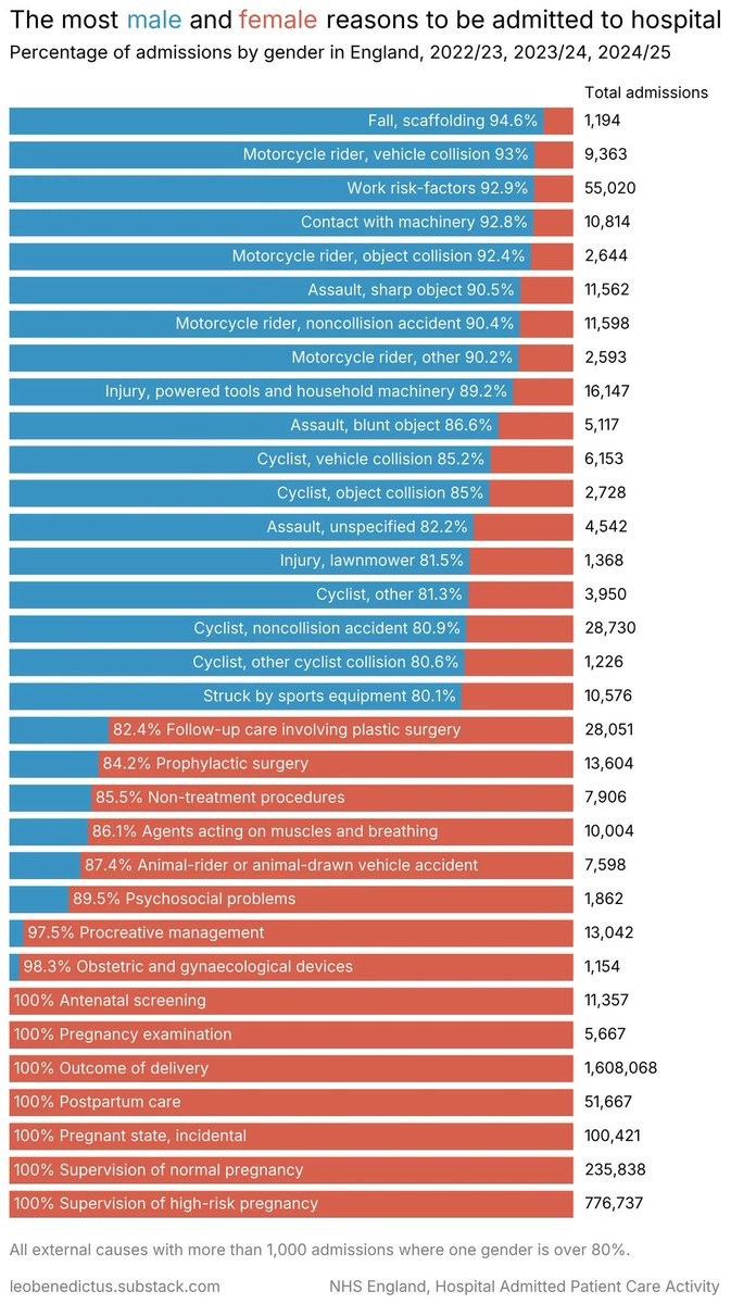
Can width of bars be changed based on number of visits? The pregnancy related ones probably skew the data. I know pie charts are terrible but could they be useful in this case?

I feel like what’s missing is the magnitude of each of these versus the others
This is a goofy graph. We have all these admissions of 100% female due to being female. Where’s the “had penis caught in chinese finger puzzle” admissions?
Probably less than 1000 cases
For now. I’ll see if I can fix that this weekend. Do you think multiple visits by the same person for the same issue count as one or multiple?
I don’t know how their dataset is filtered, but I suspect it should count as multiple.
If they rerun the analysis next year and I see the figure pop up, I’ll know whose sacrifice to honour.
I think they should be separate. Like if a woman gives birth twice in one year (ow) that would be two visits.
Can width of bars be changed based on number of visits? The pregnancy related ones probably skew the data. I know pie charts are terrible but could they be useful in this case?
Those are rookie numbers. Let’s get to work, boys!
That’s solved by the medics on scene. You’d be surprised at just how effective my medical shears are and what they can cut…
Yes. It’s shown on the right, and ought to have bee sorted by that.
Also, notice the bottom text, that it excludes all cases where neither gender is more than 80%, so only extreme differences are shown.
It’s carefully chosen to show some point, which might be interesting in some context, but not really interesting by itself without context.